Get a mobile-friendly website with Nexus
6th March, 2015
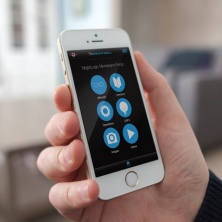
Mobile-friendly and responsive web design
Updated 08/04/15
info@nexusdp.co.uk / 01273 702525
Have you checked your website on a mobile device lately?
Go on take a look!
We discussed this topic on the blog in January and but we now have confirmation that web pages do need to be mobile-friendly to ensure they rank well on Google.
Last week Google announced that as of April 21 2015, “they will be expanding the use of mobile-friendliness as a ranking signal. This change will affect mobile searches in all languages worldwide and will have a significant impact in our search results.”
That’s it. Google will prioritise and make it easier for their search engine to find mobile optimised web pages over those that are not. So if you were sitting on the fence on this one, you had better hop down!
It's not all bad news though. The new algorithm will work on a page-by-page basis, which avoids penalising websites as a whole. This will come as a bit of blessing for many webmasters allowing them to optimise and focus on just a few pages or key landing pages to begin with.
There are a number of tests you can carry out to check your own web pages, such as Google’s Mobile Friendly Test and the Mobile Usability Report. If however you feel a little out of your depth making these changes yourself, you may want to consider enlisting the help of a web developer.
What can you do?
Now, not everyone will feel the need to get a web developer on board to make these changes but in our experience having a helping hand can avoid any mistakes, confusion and unnecessary stresses. Just ensure you take the time to look at the developers portfolio and recent work, talk through your needs and make sure they are employing Google Webmaster guidelines into there designs.
Get a mobile-friendly website with the Nexus web team.
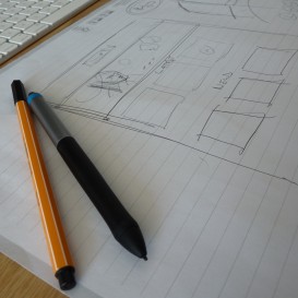
Steve and James have been designing responsive (RWD) websites for Nexus clients for a number of years now.
Here they are brainstorming away…
These friendly chaps are brilliant at what they do – they understand all the changes that are required and always take the time to talk through each stage with clients so they know exactly what they are getting from the transition.
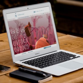
Take a look at a couple of our latest web projects...
Brighton Accommodation Agency Web Design & Build
MoA Design Ecommerce Web Development (Responsive Web Design)
Our Approach
We design with the user in mind
All our responsive websites are user focussed – we know that above all your mobile website needs to support your customer’s journey and their requirements. We take the time to really get to know what your customer needs and how they browse your site.
We understand the need for speed
When developing your mobile-friendly website we understand that making your customers wait for a web page to load is not only frustrating to the user but also has negative effects on your SEO.
For more details see SEJ’s handy article on site speed and it’s effects on SEO.
We don’t just leave you with a design
We offer full maintenance assistance and on-going support and advice. We regularly add new features to our CMS so your website can benefit from these as they are developed. We often find our clients return to us following their design for advice on digital marketing services, SEO and content marketing so we offer tailored services that will work with your site and your customers.
Going mobile-friendly doesn’t have to be a stressful experience, so let’s talk it through.
Give James a call in the studio or drop him and email…james@nexusdp.co.uk


Comments
comments powered by Disqus