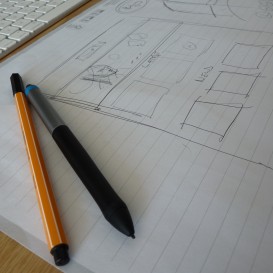
Typography terms and their meanings
Any designer worth their salt will tell you how important typography is in the graphic design industry. This vital and specialist area of the industry can really make or break your creative campaigns, so it is important to have a good grasp on the subject in order to deliver a successful campaign.
Now, we are not expecting you to want or even need to know the ins and outs of Typography and the terminology that comes with it that's what our amazing designers are for. But for those of you out there who regularly have to communicate with these creative types we figured it can't hurt to have a better grasp on some of the fundamental terms which should help you communicate your requirements clearly, saving time and energy and avoid either of you getting lost in translation.
Type Design
The art and craft of making a typeface.
Leading
The vertical distance between each individual sentence as part of a paragraph or lump of text. Your leading value will generally be the same distance throughout the text and normally larger than the font size used to make it clear and legible. The greater the leading applied to the text the further away each line of text is from the next.
Kerning
Kerning allows horizontal adjustments between individual letters or characters.Some letters or characters naturally sit too far apart or may not look visually correct, so by kerning you can manually adjust the distance to improve the overall look or add your creative touch to how the word looks. This is often used when you have large typeface used in a heading for example.
Typeface
As a simple rule this is the style, weight and shape of the type used and the characters, letters and numbers used to form a font. A typeface is often identified by a similar collective of fonts, that are designed to be used together.
Tracking
It is easy to mix up kerning and tracking. Tracking refers to the consistent spacing between the letters within a given or grouped selection of text. This aids the whole look of a body of text and provides an even balance to a paragraph and assists in the overall legibility, density and texture of the text.
Typographic Alignment
This refers to the position of your text within the margins of your text so that there is no white space at the end of a line. Your text is often aligned to the right or left margin or can be justified making the text level on both sides.
Serif
A small decorative touch / design on a typeface often found on the tips and tails of a particular font.
Sans Serif
This is simply a font which does not have a serif.
Legibility
The ease of which one letter form can be distinguished from the next.
Readability
The ease of which a block of text can be scanned by the eye.
Ok, so we know this barely touches the surface of the Typography field but hopefully we have given you a simple insight for your reference. If however you want to fill your boots with type, free fonts and tutorials then take a look at Creative Bloq's latest brilliant resource link. They've collated the best typography resources from all over the web and housed them all in one place.
We also came across this stylishly illustrated "Glossary of Typographic Terms" by the team at Canva, so be sure to check this out too.
Have fun!