Top 5 reasons to embrace responsive web design.
Flexibile design
Responsive web design has become a necessity in our modern design process. Most brands focus on desktop experiences only and leave the other devices aside. Now more than ever, consumers are interfacing with brands from anywhere and everywhere. So, sometimes we need to adjust our design and development techniques to account for new technologies.
Due to the rapid adoption of tablets and smartphones, having a website which is supported by a responsive web design is becoming more central in website development. A recent presentation featured on Comscore.com looked into the how consumers are conducting local search today with rapid adoption and use of mobile devices, “Consider for example that over 50% of time spent on the Internet now occurs via mobile access” the study and full presentation can be viewed here. It’s becoming more important for us when considering a new web development to understand the importance in designing a responsive website and whether it applies to our business or not.
But what does it mean?
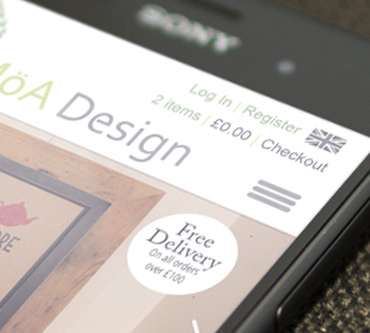
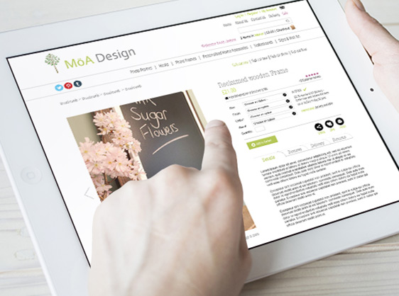
As a simple rule a responsive web design will directly adjust to the resolution of the device it's being served on. This makes your website a far more user friendly site when being used across various portable devices. The initial approach to this was found with the development of mobile optimised websites. This displays a duplication of your site, with a more simplistic view so the user can click through more rapidly and with ease.
Do I need a responsive website?
Understanding what your website does for you is key to deciding whether your website requires a responsive design. Not everyone will feel it is necessary to build an optimised site yet having a flexible and fluid layout will mean you avoid frustrating any potential customers who visit your site on a portable device. There is nothing more annoying than landing on a homepage only to spend ages pinching, double tapping and scrolling trying to get the format to load appropriately on your mobile or tablet.
Another main benefit to responsive design is that the template will be built based on the size of the screen not the device itself - this means that no matter what screen size you’re viewing on, your site will display properly for each size.
It’s also cost effective - saving you from creating a new site to suit each device, a responsive design will display appropriately on the varying screens and devices – just write it once and run it everywhere! If you still need convincing then take a look at our blog for the Top 5 reasons to embrace responsive web design.
Now you understand the benefit of responsive design we also have an engaging piece on the ‘Really useful guide to web usability’ - We give ten simple steps to cut website design costs, drive your online revenue, capture more leads, reduce your bounce rate and encourage those repeat visits. Enjoy!
Consider for example that over 50% of time spent on the internet now occurs via mobile access