How you can convert visitors into customers
The best website design will produce a site that looks good and works hard too. The ultimate aim of any website is to perform its function in the most efficient and user-friendly way possible - whether that means communicating a message, selling a product or enticing people to get in touch about a new project.
“The key to converting visitors into customers is to make sure your website is both useable and useful.”
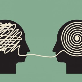
We are all about sharing knowledge here at Nexus. For us, it’s important that you understand what we do and why we do it. When UX is a key focus, certain design decisions we make in a web project are much easier to grasp when everybody involved has a fundamental understanding of usability. UX is a science, and we want everyone to be on board. With this in mind, here is our essential guide to web usability covering all you need to know.
10 Step Guide to the Importance of Web Usability
1. The factors that make up the user experience
Why a beautiful web page is not necessarily a better web page
There comes a point in most web design projects where the number of details can begin to overwhelm, and it becomes hard to see the wood for the trees. It’s all too easy to have stunning visual design cloud judgement and get sign-off without any form of testing to see how easy or intuitive it is to use. A focus on user experience from the very start of your project will bring the aim of the website back into focus and give you a product that works hard and looks great.
The basic building blocks of user experience are:
Useful. Your content needs to be original and fulfil the needs of your audience.
Desirable. The website design must be visually welcoming, interesting and attractive.
Accessible. The site must be easy to navigate and easy to find. Key content needs to be accessible to all who visit.
Credible. Great content alone is not enough: users must also trust and believe what you are saying.
2. Usability testing is easy (and free)
How can you find out what the user wants and needs?
Simple: You ask them.
The first step is to introduce iterative tests into your website designs before you even begin your build. Ask a small selection of people - five is plenty - to carry out basic tasks on your website design. At this stage, your design doesn’t have to be more than a paper mock-up. Observe the tests and note when your users get confused or can’t complete tasks. Through this exercise, you discover the areas that need more work and the things that don’t work at all. Doing this early on as well as later on in the build means that you can nip any problems in the bud - which saves time and money.
Keep testing at every stage of the build and you’ve started to place the user at the heart of your project.
3. You need great navigation at every stage
In an ideal world, your user should never be more than two clicks away from the exact page they need. Of course, on content rich sites, this is not always possible, but the navigation menu is critical in helping your visitors get to where they want before they decide to call it a day.
Keep things simple. Clear and clutter-free navigation is best, so try to limit the number of menu items as much as possible. Avoid using multiple layers if you can but, if you must use them, test to find out the most efficient way to do this.
Place your navigation strategically. It should be at the top or left of each page. Why? Because this is where your users expect to see it. All navigation categories should sit above the fold – so there is no need to scroll down to access them.
Be clear. The names you use to describe your categories should be instantly recognisable to users. This means you should avoid using idiosyncratic terms, abbreviations and acronyms.
4. Help your visitors find what they need
There are many ways to make the user journey as painless as possible.
- Include relevant internal links throughout the site to help people navigate quickly.
- Featuring boxes listing new, popular or relevant content provides another way to help users find what they are looking for.
- Create keyword tags for all your content so that visitors can quickly find areas of interest.
- Better still install a search box to place the ability to find info directly under their control.
- Site maps are not just for search engines but a useful resource for users as well.
- Fix those broken links – there is nothing that turns users off more.
“A modern paradox is that it’s simpler to create complex interfaces because it’s so complex to simplify them” - Pär Almqvist
5. User-friendly design
Simplicity in user-friendly design is essential. The best user interfaces are so natural to the user that they appear almost invisible. Unnecessary elements should be completely stripped away with clean consistency radiating through the site. As a result, the user quickly feels comfortable and ready to get on with their task.
Page layout Page layout plays a significant role in usability. Spatial relationships are used to structure the page according to a hierarchy of importance, helping to draw attention to the most important and relevant pieces of information. Never forget the importance of white space. It provides a way to highlight elements and keep the user focussed on the essentials on each page.
Colour and typography. The strategic use of colour and typography can be a huge factor in creating a good page layout. The user’s attention can be attracted or diminished through the use of colour, light, contrast and texture.
Always ensure that the background colour of your website provides sufficient contrast to the text without overwhelming it. Typography is an excellent tool for creating hierarchy and clarity through different sizes, fonts and arrangement of the text.
“The more users’ expectations prove right, the more they will feel in control of the system and the more they will like it.” Jakob Nielson
6. Visual tools to convert customers
The best designs try to anticipate what users might need to do and ensure that tools for doing this are not only provided but also easy to access, understand and use.
What tools do you have at your disposal?
Input controls. Buttons, text fields, checkboxes, radio buttons, drop-down lists, toggles and date field.
Navigational components. Breadcrumb trails, sliders, search fields, pagination, tags and icons.
Informational components. Tooltips, icons, progress bar, notifications and message boxes.
Look to market leaders. You do not need to reinvent the wheel. Popular websites such as Facebook, Google and eBay use visual elements that thousands of users are already familiar with - so it makes sense to take direction from here.
7. Easy to digest text design
According to studies carried out by the Nielsen Norman Group, the most information on a page that a reader is likely to take in is as little as 28%.
That's not to say that copy isn’t important. Well written copy is key to ensuring your website is appealing to potential customers and optimised for search engines - the critical factor is how you design your layout.
Users scan rather than read text. Time and time again eye tracking research has found that users browse website prose rather than read it. Typically they scan in an F-pattern, focusing on a couple of sentences at the top of the page before trailing down the left side and glancing at a few lines near the middle. The result is an F shape, more info on this can be found in our handy article all about copywriting for web.
How to format text on a web page. The layout of your text should reflect this scan pattern by making it easy to find what the user is looking for.
Get straight to the point. The introductory paragraph is the place to catch their attention. Let the user know what the rest of the page contains and how it will help them.
Break up your text. A scanning eye will rest more naturally where there is a break, so avoid long chunks of text and go for shorter paragraphs. Use images to provide rest points.
Format your text. Use headings and subheadings convey information and bullets quickly, or lists to provide sections that are perfect for scanning. Use highlights or bold to make keywords stand out. Keep it consistent though!
Use fonts sparingly. An elaborate font is not best suited to easy reading. Go for a sans serif font and avoid using too many different fonts in one space, as this makes the content harder to scan quickly and can often result in a muddled looking design.
![]()
8. Customer engagement at every stage
The danger of some usability studies is that they leave you with the impression that there is just one idealised ‘user’. Of course, this is not the case. There are many users with different needs, and this is where audience research comes into play. Check out our blog all about creating user personas for this explicit purpose.
Your website needs to address the needs of your customers at whatever stage of the buying process they may be. It needs to provide routes for every possible customer journey.
The customer journey. Let’s assume you are a service business that can recognise five stages to your customer's’ journey.
1. Awareness
New customers who are unfamiliar with your brand
2. Discovery
Customers who are aware of your services but want to find out more about their high-level benefits
3. Consideration
Customers who are now deciding between a few different service providers and need more specific and detailed information
4. Decision
Customers who need a compelling reason to opt for your service
5. Validation
Customers who have decided to use your service but are looking for reassurance
Your website needs to address the needs of every buying stage in your customer journey. It’s important to focus each area of your website around the requirements of users at every step.
Here’s how you could begin to map a content strategy around this journey:
1. Awareness content:
“About Us” page
“FAQ” page
“How can we help” blog post
2. Discovery content:
“Services Overview” page
Short videos detailing each service
3. Consideration content:
Detailed individual “Service” pages
PDF “Service” sheets for download
“Find out more” blog post
4. Decision content:
“Case study” pages
”Testimony” pages
Calls to action within “Service” pages
Free trial offers by email
Money-back guarantees
5. Validation content:
“Meet the team” page
Blog posts that position you as experts
Customer lists
“Awards” page
9. Site speed
One thing that is often forgotten when considering usability is speed. Your web designers need to focus on load time and here’s why.
- Adding just one extra second to your load time can reduce your conversions by 7 percent.
- The majority of users will abandon your site if it takes more than 6 to 10 seconds to load.
- Nearly half of all users expect a web page to load in under 2 seconds.
Source: Kissmetrics
Your web pages should load in at least 4 to 6 seconds, or it just won’t matter how usable it is because there will hardly be any users sticking around long enough to find out.
Here are some quick tips to get things loading quicker.
Avoid multimedia overload. Large video, photo and flash files should be added judiciously if you want to avoid slow pages.
Compress images. Compressed images help to minimise load time.
Watch those redirects. This one can be a difficult call to make, but it is a fact that redirecting external links to old pages by using internal redirects can drastically slow down your webpage.
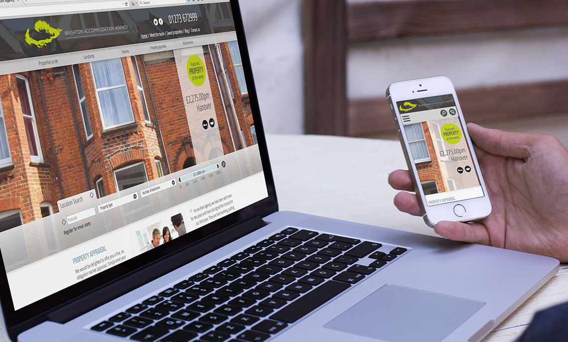
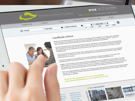
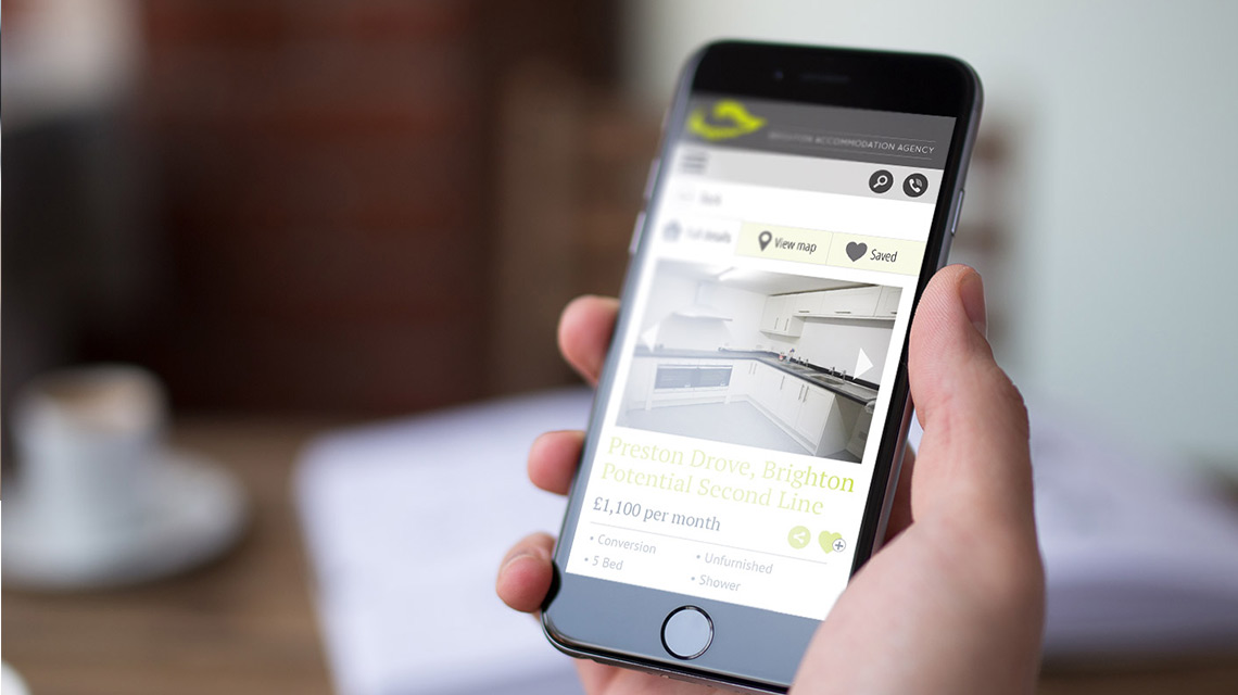
10. Cross platform usability
There is no excuse for a website that isn’t responsive!
No matter what the nature of your website is, you can guarantee that users will be accessing the site from desktop, laptop, tablet and mobile. It’s a no-brainer that your site should work beautifully across all these platforms.
Some websites might require special consideration. For example, some B2B companies will attract a significant majority of desktop users, so the design should be lead by the desktop experience. Other websites that are, for example, aimed at teenagers might have an enormous amount of traffic from mobile users, so it makes sense to design the site mobile first. Looking at your website’s analytics will show you where your traffic comes from.
According to research carried out by Google, 67 percent of users are more likely to buy from a site if it is mobile-friendly. What’s more, 50 percent of users said they would be less liable to use a site if it wasn’t mobile-friendly - even if they loved the brand.
It’s certainly not worth taking the risk.
Usability is your friend
Now that you know all about usability and why it’s so crucial to the success of a website, why not give us a call to find out how you can get your website up to scratch. Our team can carry out a free of charge review your site and provide a full set of recommendations. Usability could be the key to unlocking new opportunities for your organisation - get in touch today.