Blog post
5 Design Secrets From The Nexus Studio
Fancy finding out what makes the Nexus creative team tick? Check out our new blog to find out...
Brightwell manufacture and design commercial dispensing solutions. A global company established over 60 years ago, their specialities include paper, soap and chemical dispensers crafted from innovative designs perfectly suited to their purpose.
Although Brightwell holds a leading position in their market and have accrued a sterling reputation across the globe, their values remain very much at the core of their day to day operations and they never stray too far from their family-run foundations. Based locally, Brightwell have worked closely with Nexus on a number of successful projects over the years.
Nexus are a small, approachable and affordable design agency full of creativity, pro- activity and friendliness. I invited them as part of a bid a little more than a year ago and they came in with a really professional, comprehensive approach to the brief, immediately neutralising their competitors. Since then, we've reviewed all our literature, created templates for manuals, designed various flyers and more recently revamped our whole website together. More projects are in the pipeline, others will pop up more sporadically and I trust Nexus fully for quality, speedy work. It is not often that I officially compliment a stakeholder, but this time it's a definite thumbs-up!
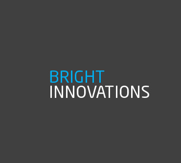
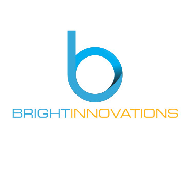
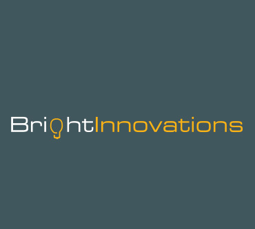
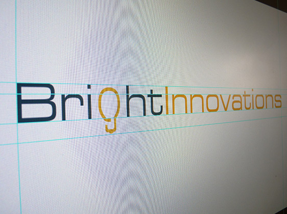
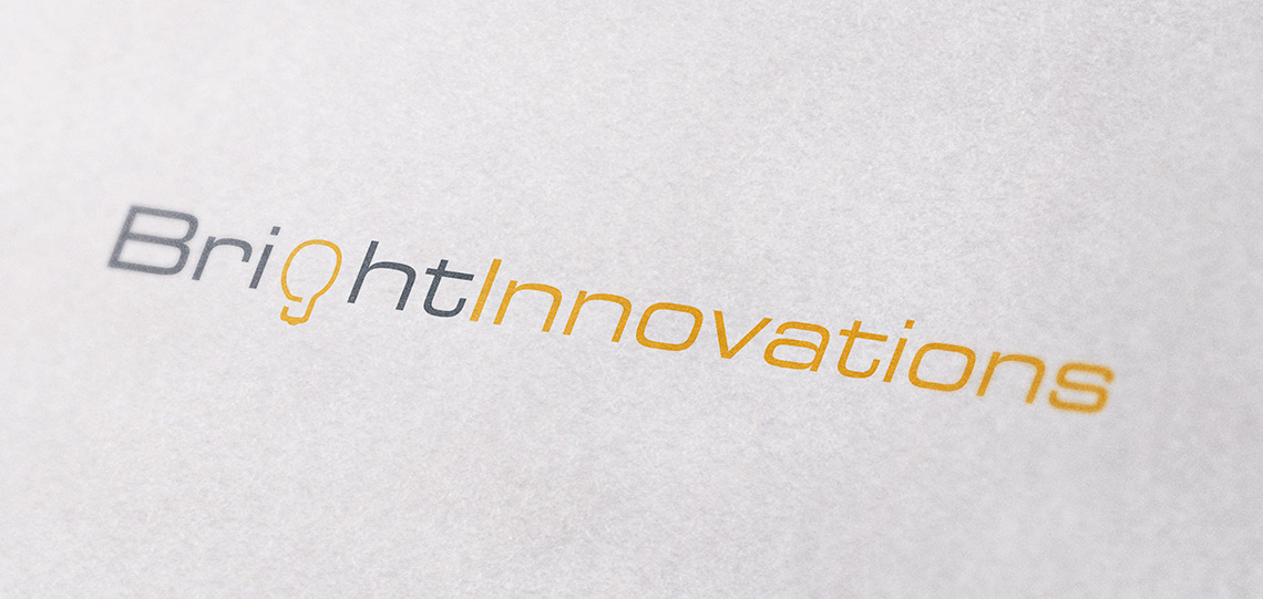
After a successful website relaunch Brightwell were keen to keep up the momentum and asked us to take a look at a rebrand for their sister company. Bright-innovations is the 'Research and Development' arm of Brightwell and is also responsible for the creative solutions offered to their clients.
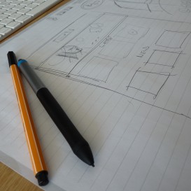
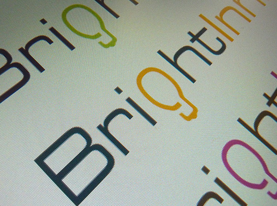
We spent a period of time researching the target audience and establishing what was and wasn't working with the old logo. We decided that it was important to keep some continuity with the old brand so retained the Orange Pantone. We knew from our research that the font choice was going to be key to the success of the logo. We chose modern, san serif fonts and adapted the kerning to increase overall legibility. We worked up several of the concepts from the initial brainstorm session and presented them for review.
After some refinements the 'Lightbulb' logo was chosen as it communicated the nature of the company at a glance. The logo has been very well recieived to date by both new and existing clients and has laid strong foundations for future brand development.
Fancy finding out what makes the Nexus creative team tick? Check out our new blog to find out...
Businesses need designers who care, which is why we treat your brand as if it were our own. Find out how our graphic design delivers results. ...

Writing a marketing strategy is important! We explain the essentials you'll need to cover. ...
Website development and web design are what we live and breath. Speak to us today about how we deliver stunning UX and tangible results for clients across the UK....