A practical guide to using fonts legally
11th March, 2016
Throughout this series of blogs we will be answering your questions relating to print ready artwork, helping you to avoid costly print delays.
Following on from our previous post which answered the questions, ‘Have I added images correctly, and what colour mode should my images be?’
This post details how to check that you have permission to print the fonts you’ve used, as well as tips on how to make your text legible, through doing so we will answer the question, ‘Have I used my fonts legally?’

You may not have thought about the legality of the fonts that you’ve used in your design but it can become a serious issue if not addressed correctly. As when you export your finished artwork, you will most likely have to embed the fonts you’ve used, and if the font’s license prohibits this you will not be able to print the font.
Therefore, the first step in selecting a font is to check if the font’s license allows it to be embedded. Here at Nexus Design & Print we use fonts from websites such as Font Squirrel. Font Squirrel sources a wide range of high quality commercial-use fonts that are easy to download and install.
On Font Squirrel, font licenses are listed under the Licence tab for each font. As you can see in Figure 1, the font example ‘Alex Brush’ is free for commercial use and can be embedded into a print document.
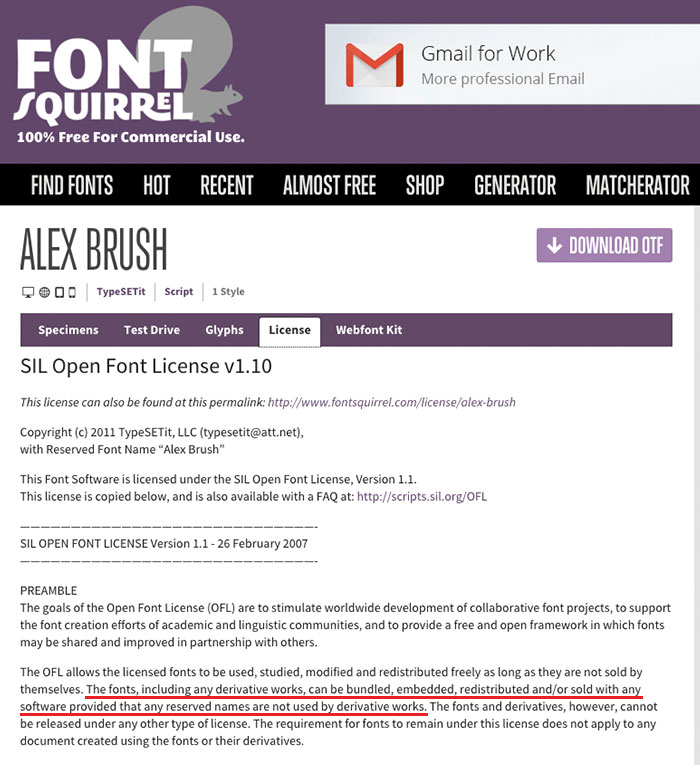
Figure 1: Example of a font licence on Font Squirrel
Another tip when working with type, if you intend to print black text you need to make sure it’s solid black, rather than rich black. Rich black, is an ink mixture of solid black over one or more of the other CMYK colours, which can saturate the paper and make the text difficult to read.
This is particularly critical when importing text from a Microsoft Word document or an email, as the text is usually RGB or rich black rather than solid black (100=K). After placing text into your document, make sure to set the text colour to solid black by selecting the text and choosing the '[Black]' swatch from the swatches panel (see Figure 2)
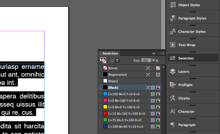
Figure 2: Swatches panel
Plus, to further ensure legibility, set the size of the text to 8 points or higher. To get an idea of how it will print we’d suggest turning on Overprint Preview (View > Overprint Preview) and view your document at actual size (Cmd+1 on a Mac or Ctrl+1 on PC).
We hope you have found this blog helpful and you can now confidently find suitable fonts and create legible text that prints correctly. If you have any questions please comment below or call us on 01273 702525


Comments
comments powered by Disqus