Brighton SEO: How to make mobile design at the heart of your designs
13th May, 2015

Part of a series of posts that bring home the best of Brighton SEO for anyone who couldn’t make it. Find out what you missed as we review the stand-out presentations so you can get the key takeaways.
First up is Vicke Cheung of Distilled who provided us with ten ways to place mobile first.
Mobile is a big deal
If this is news to you: where have you been?
The recent fall-out from Google’s so-called Mobilegeddon continues to reverberate through the web but the facts had already spoken for themselves without the need for the search giant’s oversized boots leaving a deeper impression.
The tipping point where mobile usage overtook desktop actually came last year, and it’s not just the number of users we are talking about but the time each user spends browsing on a mobile or using apps.
Search Engine Watch called this “the biggest shift since the internet began”.
So what are we doing about it?
Vicke’s presentation focussed on ten ways we can place mobile first in our designs. You can check out the ten (beautifully designed) slides here. We’re just going to deliver the key messages.
The problem with responsive design
“Mobile site needed? We’ve got you covered – we’ll design it responsively...”
The problem with responsive design is the way it is approached. How many times have we heard designers reassure clients that they will “nail” the desktop site and then “make it mobile”?
As a result all those non-transferrable processes that actually made the desktop design get stripped out and you are left with a poor mobile imitation.
Here’s how it should work.
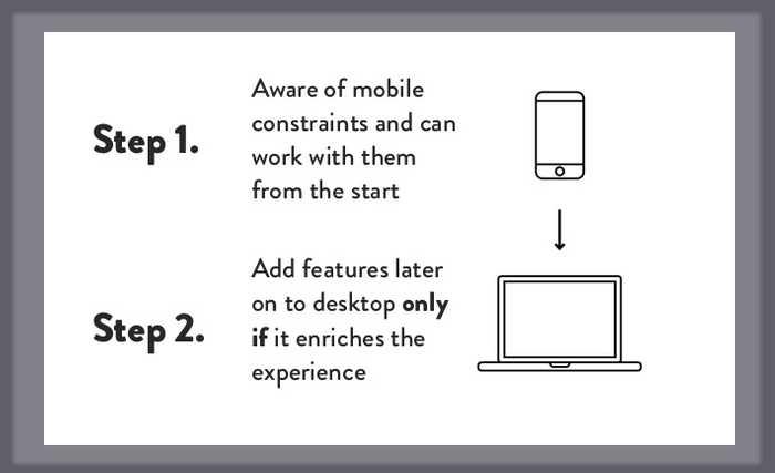
Original Source: Slideshare, Vicke Cheung.
Start from what works on mobile. And only add to it if it truly enhances the user experience on desktop.
Space: the final frontier
Mobile design is not limiting: it simply forces us to do only what is needed.
Space on a mobile screen is limited. The solution is not to try and cram as much as you can in but to review what is truly necessary.
After all, this reduction process lies at the heart of all great design.
“The simplest way to achieve simplicity is through thoughtful reduction”
John Maeda
Your page designs need to focus just on the core elements: kiss goodbye to all else and “Keep It Simple Stupid”.
(The good news is the user experience on your desktop site will also benefit as a result).
You are not in control...
This is the hardest lesson for any designer to learn.
Designing for different browsers and different devices means that your designs must be measured and will render differently.
It is impossible to try and force your designs to render exactly as you want them in different viewing environments. It is possible to create designs with flexibility so they work – not always in exactly the same way – across all browsers.
You are not in control…but you are able to design flexibly.
...Except of testing
Poor old Icarus.
He’d tested his wings out on paper but, as he fell towards the earth, how he wished he’d tested his ideas out in a real environment.
Now spare a thought for the web designer.
They’ve tested their site out on Google Chrome for its responsive display elements (you can find a step-by-step explanation of how you do this on Vicke’s slide deck) and sit comfortably back in their chair with a satisfied smile.
The problem is they haven’t actually tested their web pages on all the devices that will be used to access it. The design may have looked great on iPhone etc. but with so many devices out there designers just can’t afford to rest too quickly.
Just look at that black line at the bottom of the design as it merges into the Android phone’s frame…

Original Source: Slideshare, Vicke Cheung.
Another design falls short of the mark.
Mobile first
The challenge of mobile first design is really the challenge of accepting that our designs must work however our websites are accessed.
It is about our ability to work flexibly and adaptively.
And with the Internet of things looming ever closer on the horizon it will soon not just be mobiles that we need to design flexibly for.


Comments
comments powered by Disqus