Long days, late nights and a few trips to the pub...
13th October, 2014
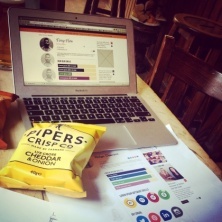
We’ve been pretty busy lately. And by busy we mean there have been a bunch of late nights, some long weeks and a few rather tired mornings and here’s the reason why.
At the start of the year we took a little look at ourselves and realised we wanted and needed to make some adjustments and re-assess our approach to our own online presence. After a couple of wrong turns we knew we had to make some big movements in the way of SEO and digital marketing in order to push our business forward and finally get our site working with us not against us.
So saw the start of an intensive 6 month strategy to re-address the design, development, content and overall approach to our website.
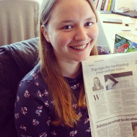
After a good look at the analytics of our site, our SEO boffin explained that a new content strategy was required. A few meetings later we pulled apart our traffic report and we agreed on a plan of attack.
We realised that with our team’s collective experience we should be sharing our knowledge, expertise and experience more effectively, with more than just a few blog posts and the occasional tweet about our projects and work. We began to write and produce some great new content but it was immediately clear that there was nowhere to house all of this glistening new content…
We needed a new website.
We had our first site development meeting back in April to outline everyone’s responsibilities and get the ball rolling. The main consideration at this stage was to re-purpose the content internally and externally and it was evident that additional subpages needed to be introduced.
Another week, another meeting, this time attended by our designer James and web developer Steve. This brainstorming session finally gave us the clarity we were all looking for. We took the time to evaluate the site, considering each and every angle and how it would affect our SEO and rankings. We looked at the design, development and of course the usability of the site. We realised by using a tagging system we would have full control over where the content was displayed. This would offer up a range of differing yet relevant content the more the user delved into the site.
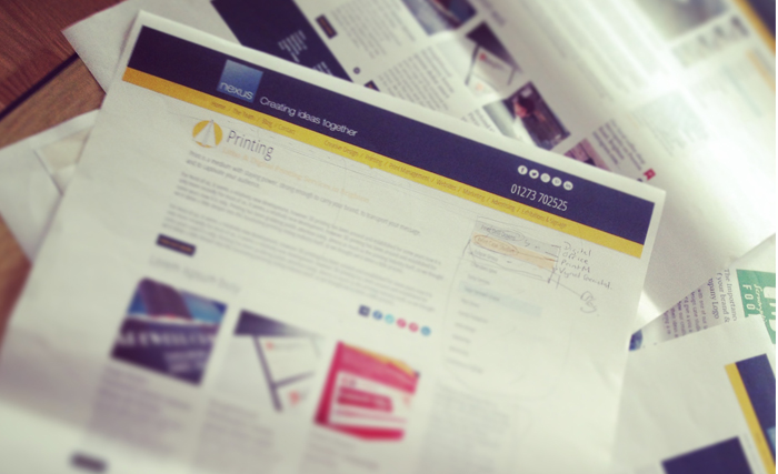
With an implementation plan in place, work began on the design. We wanted to approach the site in a completely different way. It was highlighted throughout SEO analysis that we needed to assist our clients and guide them through the site by:
- Introducing sub category pages that would act as content hubs.
- Every page required more internal links that would display related tagged content.
- Better integration of social media.
- Designs that use above the fold space to help focus our conversion and encourage deeper exploration using linked in content for better distribution of authority.
Along with all this new content, we knew that we wanted the site to have a far more visual approach. We chose to re shoot the majority of our photography for the site so needed to consider how we would present these images and differing content in a simple yet stylish way. James decided to take on a kind of newsy approach to the design. In the same way you might use a magazine site, our site is now easy to navigate, always being incited with different content, from an article to a blog post to a social media feed.
 James explains his creative thinking behind the design…
“Following our SEO research it was agreed that our site needed to rely much more heavily on written content.
I was keen to move the design away from the traditional ‘brochure site’ format which would have struggled to handle large quantities of content effectively. I opted to create a much ‘newsier’ feel, more in line with online magazines so I edged the design and navigation toward applications such as ‘Flipboard’.
I wanted our mobile and tablet version to bring something more to the table in terms of design and interaction. Rather than being the poor relation to the desktop site they now offer their own user experience, unique to mobile devices and embrace the way we all connect and share content."
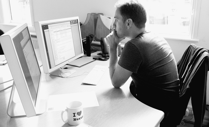
With the design signed off, development of the site and CMS began. The project certainly put our web developer Steve through his paces and we’ll be honest, we all definitely underestimated the amount of work this project would involve.
As part of our strategy we also wanted to improve our approach to social media. Having a place to share our new content is vital. After all, once you have taken the time to produce the content you need to talk about it! This is how you make people aware it is out there and make it nice and easy to find.
The integration of our feeds into the site helped marry up our new approach to content. This proved to be quite tricky due to each social site having differing documentations and regulations. Facebook proved particularly difficult and Steve may have gained a few sleepless nights because of it. In fact I’m sure he won’t mind me sharing this snippet from an email following the issues with integrating some social media feeds… “Sorry about the long email. It look me longer to write than it took you to read. I've been sat here since 1937.”
The challenge proved to be worthwhile and we are now able to control the amount of feeds that run through the site, to which page and how many.
The final pièce de résistance for the three of us was the team profile pages. This section of the site was a chance for us to have a bit of fun. It was evident when I arrived at Nexus that this was a close team of people who have worked as a collective for many years. The old site didn’t really demonstrate this to our clients, so we wanted to freshen up the look and general approach to ‘The Team’ page as a whole.
After a bit of research and discussion James and Steve put their thinking caps on to see how they could put our ideas into action.
Our analytics had shown our team page and staff bio pages were getting a lot of traffic but had a high bounce rate. In my experience staff bio pages can be a bit of an afterthought in web design so following our discussions I decided to offer a more colourful, info-graphic based page. Bespoke to the individual, complete with personalised social feeds they are intended to be fun, informative and give a better overview of the individual both professionally and personally.
As per most design agencies we have quite an obsession with coffee so we wanted to incorporate this into our profile pages - naturally it quickly became a bit of a competition. Poor Richard is still currently ranked – 40 on our coffee making chart and we look forward to seeing his points rise in the coming months.
And so we have reached launch day, we have undoubtedly all learned a lot from this project and we have to say we are really quite pleased with it.
There is still a lot more to do, this is really just the starting point for our ongoing content strategy, we’ve many busy days ahead but for now, we raise our coffee cups and invite you to take a look around - we’d love to hear your thoughts.
I think the new website looks great with brilliant functionality and I like the new features such as your guide to printing. Very nice.


Comments
comments powered by Disqus