Packaging. Does it stand the test of time?
14th September, 2010
How many times have you gone to the supermarket to pick up your favourite breakfast cereal only to find its been re-named, re-designed or just scrapped all together without prior warning? Its frustrating to say the least and even major brands have admitted that re-branding may not always to the most effective communications tool available. Take Kellogg?s Coco Pops for example; they controversially changed their name to Choco Krispies in 1998 to bring the brand in line with its European relatives but after national outcry and a survey into consumer preferences, the name was quickly reverted back to the original.
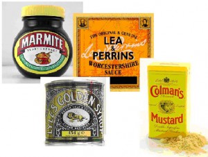
Consumers feel an affiliation with the brands they buy and packaging plays a huge part in this. Many well-known and well-loved brands have hardly altered their design since appearing on our shelves and are as popular today as they ever have been. To name a few, Lea & Perrins Worchestershire Sauce, Lyle's Golden Syrup and Colmans mustard have hardly changed their design since the products first launched.
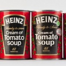
Other brands are reverting back to original designs as a way of honoring their heritage. Heinz Tomato Soup celebrates its 100th anniversary this year and in commemoration of this, is bringing out a limited edition label for its soup cans that replicates the original produced in 1910.

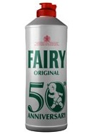
Back in February, Fairy re-introduced its washing up liquid in the original white bottle and red cap packaging as a way to celebrate their 50th anniversary. Speaking to Talking Retail, Paul Lettice, trade communications manager at Procter and Gamble said "Bringing back the white bottle is our gift to both consumers and our retailers for five decades of support."
Many marketers have put the success of these brands and their original style packaging down to their ability to survive a recession. "In changing times people fall back on the brands they consumed earlier in their lives, when times were less uncertain", says Rune Gustafson, the chief executive of the branding consultancy Interbrand.
By keeping packaging familiar and recognisable, consumers are able to rely on a trusted name and gain reassurance in what they know and love.
I love the retro designs. All too often these days packaging artwork can go way over the top, to the point where its difficult to actually establish what you are about to consume. I like the fact that these simple designs would have been drawn by hand, without the aid of any design or photography software. To me it makes them feel slightly more authentic and I like to imagine the artist surrounded by rolls of screwed up drafts, working on every fine detail till its just right.
Sources:
http://www.timesonline.co.uk/tol/life_and_style/food_and_drink/article4962511.ece
http://www.rajapacktoday.co.uk/2010/02/retail-packaging-of-fairy-liquid-returns-to-the-1950s/
http://money.uk.msn.com/markets/photos.aspx?cp-documentid=151696081&page=3
Comments
comments powered by Disqus