Can a Leopard change its spots?
22nd April, 2008

One of the hardest decisions you have to make when starting a business is how best to brand yourself. The design has to be considered, measured and perfectly reflect the image you are striving to convey. Getting it right can be the difference between success and failure.
It is little wonder then, that the thought of rebranding can feel like a bitter pill to swallow. However, rebranding is a necessary process and the key to an enduring image. There are many reasons that it may be necessary to affect a rebrand, for example it could be that the brand may simply have been wrong from the start. (2012 Olympics anyone).
There is never a shortage of advice, it is always easy to find and is more often than not influenced by an individuals personal taste without considering the bigger picture or the wider audience. It is the job of the designer to remove himself from the design process enough so as not to allow personal preference to wrongly direct the solution to a brief.
The idea of branding is, after all, to reach the correct demographic. Please see below a selection of relevant case studies.
It could be that your brand has worked well enough for years but is now struggling to maintain its credibility in the contemporary market. Times move on, fashion and trends change and technology offers greater scope for creativity. What worked once upon a time may now look outdated.
Be careful not to attach yourself to the latest trend. Your logo doesn't need to be a literal representation of what your company does (e.g. imagine a data storage company whose logo was based on a floppy disc. It would look hopelessly outdated in todays market where online storage is at the cutting edge). It may be that a simple strapline change is enough, turning a negative into a positive or it may require a complete overhaul.
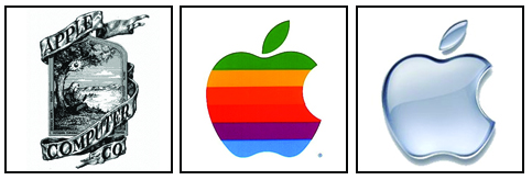
Take Apple for example, the global brand we know today has come along way since its conception nearly 30 years ago. They are a perfect example of how a company has rebranded to amazing success. The first Apple logo was a picture rather than a logo (it showed Sir Isaac Newton sitting beneath the famous apple tree thinking about gravity) but it was only ever used for the 'Apple I' as Steve Jobs felt that it was too intellectual. It was also an impractical logo as it would have been almost impossible to put on the product due to the fine details of the drawing.
In 1977 Steve Jobs asked the designer Rob Janoff to design a new Apple logo. The new logo had a simple shape of an Apple, bitten into, with the colours of the rainbow in the wrong order. The bite symbolized knowledge (as in the bible where the apple was the fruit of the tree of knowledge) and the bite could also be pronounced "byte", a reference to computer technology.
When Apple's Jean Louis Gassée was asked about this logo he answered:"One of the deep mysteries to me is our logo, the symbol of lust and knowledge, bitten into, all crossed with the colors of the rainbow in the wrong order. You couldn't dream of a more appropriate logo: lust, knowledge, hope, and anarchy."
In 1997, Steve Jobs decided to drop the multi-colored Apple logo and replace it with a mono version. They have never looked back. The shape remained fundementally the same but was brought up to date by stripping it back to its basic clean lines.
If your logo has been (and it should have been) created with a strong recognisable form, it is an easy enough transition going mono. It will make your logo infinitely more adaptable and future-proof friendly (it's also cheaper to print!). Consider your company's corporate identity. Is it time for a facelift? Don't be complacent or underestimate the power of a good brand makeover. After all if it was good enough for Apple!
Acknowledge the past, recognise the present and embrace the future.
Can a Leopard change its spots? Absolutely.
James Morrison
Comments
comments powered by Disqus